Laying out Components
Often you want to view more than one thing at a time in a single Rig. Perhaps you want your calendar on the left, and the weather on the right. Or the current time at the top, and a countdown to when you have to leave the office underneath.
Slipway, being renderer agnostic, doesn't itself provide a way of doing this.
But the slipwayhq.render Component does.
The Render Component is a partial implementation of an Adaptive Cards renderer.
If you look at the Adaptive Cards website you might wonder why we chose to use something that looks like it was designed for inserting forms into Microsoft Outlook and Teams.
But actually:
Adaptive Cards are platform-agnostic snippets of UI, authored in JSON [...] that automatically adapts to its surroundings.
That actually sounds ideally suited to Slipway, where Rigs are built using JSON, and we need to render them for all kinds of different devices.
While the Render Component is only a partial implementation of Adaptive Cards,
it is sufficient to do some fairly complicated layout.
The following card
(see JSON here)
is based on this example
but was rendered in Slipway using the slipwayhq.render Component:

Quite a nice way to get started on a new layout is to use the Adaptive Cards designer available here.
Inserting Components
Laying out text and images is one thing, but what we really want to do in this document is insert the output of other Components.
We'll do that next.
A Simple Layout
Let's start with a simple Rig, which we'll call example.json, which has a text block
at the top and space for two Components side by side underneath:
{
  "rigging": {
    "render": {
      "component": "slipwayhq.render.0.7.0",
      "allow": [
        {
          "permission": "fonts"
        }
      ],
      "input": {
        "canvas": {
          "width": 800,
          "height": 480
        },
        "card": {
          "type": "AdaptiveCard",
          "body": [
            {
              "type": "TextBlock",
              "text": "Let's insert two components below this line.",
              "wrap": true
            },
            {
              "type": "ColumnSet",
              "height": "stretch",
              "columns": [
                {
                  "type": "Column",
                  "style": "good",
                  "width": "stretch"
                },
                {
                  "type": "Column",
                  "style": "attention",
                  "width": "stretch"
                }
              ]
            }
          ]
        }
      }
    }
  }
}
If you save this locally then you can run it using:
slipway run --allow-all -o output.png example.json
We've specified -o output.png which tells Slipway to save the Rig output into the file output.png.
You'll see something like this:

The Host Config
The green and red boxes are because I used "style": "good" and "style": "attention" in
the JSON. The philosophy of Adaptive Cards is you specify styles at quite a high level
in the card JSON and the actual rendering styles (colors, fonts, margins, etc)
are controlled by a "host config".
We can specify a basic host config to change some of these:
{
  "rigging": {
    "render": {
      "component": "slipwayhq.render.0.7.0",
      "allow": [
        {
          "permission": "fonts"
        }
      ],
      "input": {
        "canvas": {
          "width": 800,
          "height": 480
        },
        "card": {
          "type": "AdaptiveCard",
          "body": [
            {
              "type": "TextBlock",
              "text": "Let's insert two components below this line.",
              "wrap": true
            },
            {
              "type": "ColumnSet",
              "height": "stretch",
              "columns": [
                {
                  "type": "Column",
                  "style": "good",
                  "width": "stretch"
                },
                {
                  "type": "Column",
                  "style": "attention",
                  "width": "stretch"
                }
              ]
            }
          ]
        },
        "host_config": {
          "spacing": {
            "default": 40
          },
          "fontTypes": {
            "default": {
              "fontSizes": {
                "default": 30
              }
            }
          },
          "containerStyles": {
            "good": {
              "backgroundColor": "#c5c",
              "borderColor": "#00f",
              "borderThickness": 4
            },
            "attention": {
              "backgroundColor": "#f5a",
              "borderThickness": 0
            }
          }
        }
      }
    }
  }
}
Running this new rig will produce the following:

This is quite useful because you could potentially define different host configs for each device using the device context, and then the same Rig could be used for each of them, with the final rendering being appropriate for each device.
However as I clearly have no taste let's leave the host config out so that the defaults are used.
Adding Images
As a next step, let's put some images in those boxes and get rid of the background colors. We'll use a service called Lorum Picsum to serve us some arbitrary images. We also need to give the Render Component permission to make HTTP requests to that domain.
{
  "rigging": {
    "render": {
      "component": "slipwayhq.render.0.7.0",
      "allow": [
        {
          "permission": "fonts"
        },
        {
          "permission": "http",
          "prefix": "https://picsum.photos/"
        }
      ],
      "input": {
        "canvas": {
          "width": 800,
          "height": 480
        },
        "card": {
          "type": "AdaptiveCard",
          "body": [
            {
              "type": "TextBlock",
              "text": "Let's insert two components below this line.",
              "wrap": true
            },
            {
              "type": "ColumnSet",
              "height": "stretch",
              "columns": [
                {
                  "type": "Column",
                  "width": "stretch",
                  "items": [
                    {
                      "type": "Image",
                      "url": "https://picsum.photos/$width/$height",
                      "height": "stretch"
                    }
                  ]
                },
                {
                  "type": "Column",
                  "width": "stretch",
                  "items": [
                    {
                      "type": "Image",
                      "url": "https://picsum.photos/$width/$height",
                      "height": "stretch"
                    }
                  ]
                }
              ]
            }
          ]
        }
      }
    }
  }
}
Running this new rig will produce the following (but likely with other random images):

But wait a second, we did something clever here! Our image URLs look like this:
https://picsum.photos/$width/$height
Lorum Picsum expects $width and $height to be actual numbers, so it knows
what size images to return, but we've put the actual strings $width and $height.
The Render Component does a bit of magic when sees these strings in a URL.
It waits until it has finished the layout pass, so it knows what the dimensions need
to be, and then it substitutes $width and $height with the
actual required dimensions.
You can see this in the console output:
component{=render:slipwayhq.render}: Loaded image from URL: https://picsum.photos/378/418 (378x418)
component{=render:slipwayhq.render}: Loaded image from URL: https://picsum.photos/378/418 (378x418)
Adding Components
When the Render Component loads the image, like any other Component it must go through
the Host API's fetch method.
The fetch method doesn't just support https:// URLs.
It can also handle env:// URLs to fetch environment variables, and file:// URLs to load
files from the file system.
And, critically, it supports component:// to load files from components, and to
execute components.
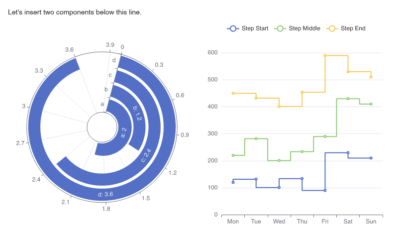
Let's show the final Rig, which is going to render two charts using the slipwayhq.echarts Component, and then we'll explain the bits we've changed:
{
  "rigging": {
    "render": {
      "component": "slipwayhq.render.0.7.0",
      "allow": [
        {
          "permission": "fonts"
        },
        {
          "permission": "registry_components"
        }
      ],
      "callouts": {
        "echarts": {
          "component": "slipwayhq.echarts.0.5.1",
          "allow": [
            {
              "permission": "fonts"
            },
            {
              "permission": "registry_components"
            }
          ]
        }
      },
      "input": {
        "canvas": {
          "width": 800,
          "height": 480
        },
        "card": {
          "type": "AdaptiveCard",
          "body": [
            {
              "type": "TextBlock",
              "text": "Let's insert two components below this line.",
              "wrap": true
            },
            {
              "type": "ColumnSet",
              "height": "stretch",
              "columns": [
                {
                  "type": "Column",
                  "width": "stretch",
                  "items": [
                    {
                      "type": "Image",
                      "height": "stretch",
                      "url": "component://echarts?width=$width&height=$height",
                      "body": {
                        "chart": {
                          "polar": {
                            "radius": [
                              30,
                              "80%"
                            ]
                          },
                          "angleAxis": {
                            "max": 4,
                            "startAngle": 75
                          },
                          "radiusAxis": {
                            "type": "category",
                            "data": [
                              "a",
                              "b",
                              "c",
                              "d"
                            ]
                          },
                          "tooltip": {},
                          "series": {
                            "type": "bar",
                            "data": [
                              2,
                              1.2,
                              2.4,
                              3.6
                            ],
                            "coordinateSystem": "polar",
                            "label": {
                              "show": true,
                              "position": "middle",
                              "formatter": "{b}: {c}"
                            }
                          }
                        }
                      }
                    }
                  ]
                },
                {
                  "type": "Column",
                  "width": "stretch",
                  "items": [
                    {
                      "type": "Image",
                      "height": "stretch",
                      "url": "component://echarts?width=$width&height=$height",
                      "body": {
                        "chart": {
                          "tooltip": {
                            "trigger": "axis"
                          },
                          "legend": {
                            "data": ["Step Start", "Step Middle", "Step End"]
                          },
                          "grid": {
                            "left": "3%",
                            "right": "4%",
                            "bottom": "3%",
                            "containLabel": true
                          },
                          "xAxis": {
                            "type": "category",
                            "data": ["Mon", "Tue", "Wed", "Thu", "Fri", "Sat", "Sun"]
                          },
                          "yAxis": {
                            "type": "value"
                          },
                          "series": [
                            {
                              "name": "Step Start",
                              "type": "line",
                              "step": "start",
                              "data": [120, 132, 101, 134, 90, 230, 210]
                            },
                            {
                              "name": "Step Middle",
                              "type": "line",
                              "step": "middle",
                              "data": [220, 282, 201, 234, 290, 430, 410]
                            },
                            {
                              "name": "Step End",
                              "type": "line",
                              "step": "end",
                              "data": [450, 432, 401, 454, 590, 530, 510]
                            }
                          ]
                        }
                      }
                    }
                  ]
                }
              ]
            }
          ]
        }
      }
    }
  }
}
First, we've given the Render Component permission to load other registry components.
This is needed so it can actually call out to the slipwayhq.echarts Component that we're going to
use to render some charts.
Next, we've added a callout definition to our Render Component.
This lets Slipway know in advance what Components are potentially going to be used,
so it can ensure it's got them all cached locally.
It also passes through any relevant permissions to slipwayhq.echarts.
In this case we pass through both the fonts permission, because
the echarts Component needs to be able to access fonts so it can render text,
and the registry_components permission, because the echarts Component internally uses
other Components such as slipwayhq.svg to render the chart.
Next, in place of the image URLs, we specify Component URLs:
"url": "component://echarts?width=$width&height=$height"
The component://echarts part of the URL tells Slipway that we want to execute the
Component callout called echarts, which we mapped in the callouts section to slipwayhq.echarts.0.5.4.
The ?width=$width&height=$height is the earlier Render Component magic, where it substitutes
$width and $height with the actual calculated measured dimensions.
There is some extra Slipway magic here as well, which is that when fetching a component:// URL,
the query string arguments are applied to the Component input.
In this case it means that Slipway will set the width and height properties at
the root of the input to the calculated width and height.
You can actually specify more complex arguments here, such as foo.bar.bat=55 and Slipway
will apply 55 to that path in the Component's input JSON.
The final trick here is we provide the rest of the input for the ECharts Component
using the body parameter that sits alongside the url parameter in the Adaptive Cards
image.
All of this combined means that the EChart Component gets asked to generate a chart in the exact, pixel perfect size required to be slotted into the Adaptive Cards layout.
Obviously in reality any ECharts input JSON would be dynamically generated, probably by another Component.
Or you might instead insert a GitHub commit graph, or your solar and battery stats.
But the nice thing here is that the Render Component isn't actually anything special. Anyone can implement similar functionality in their own rendering Components if they decide to write one. This keeps Slipway completely renderer agnostic.